UEI: User Experience Evaluation

User Experience Evaluation
For Kyndryl.com
Glenn McLaughlin
Director of User Experience
Journey Overview
January 2023
Description
Understand what Kyndryl Bridge is.
Objectives
- Find information on Kyndryl Bridge.
- Learn what it is about to convey to leadership team in weekly staff meeting.
Background Information
Archetype: Service Manager
Persona: Service Provider (Malcolm – slide 9)
Jobs To Be Done (JTBD):
- Find information on Kyndryl’s, ‘Kyndryl Bridge’.
- Understand what Kyndryl Bridge is.
- Learn how Kyndryl Bridge can benefit the organization.
- Learn how to get started with it.
View Kyndryl.com
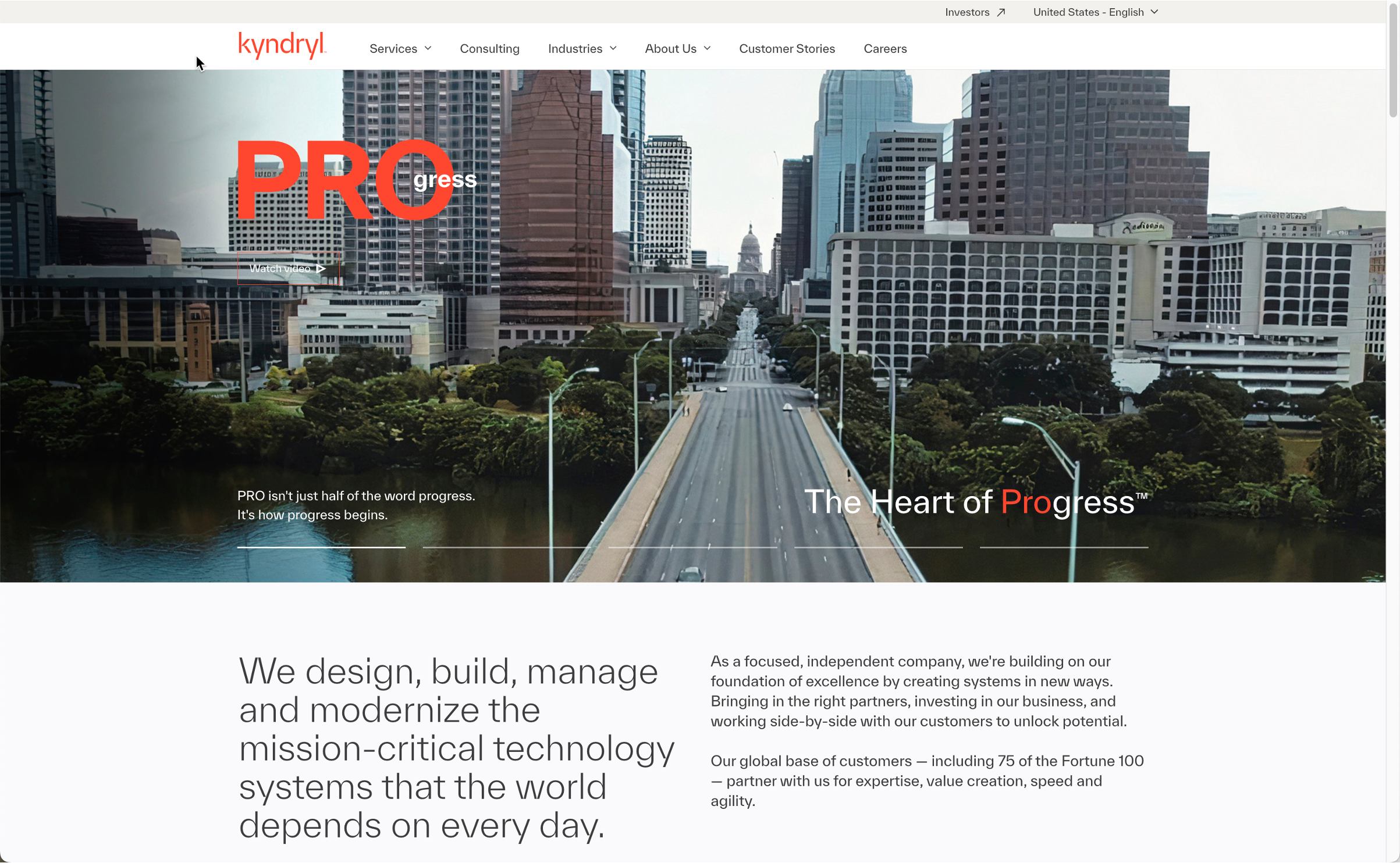
Homepage
Feeling: Neutral
Observations:
The customer goes to the Kyndryl.com website.
Pain Point:
None
Lets create a standard slide
This is not a emotion slide
- sfgkjhsdfdshi
- ‘dsfkldshldks
- sdlkfhsdlfkh
- ‘sdfdshksdhsd
This is the new slide title
This is the subtitle
Feeling: Neutral
Observations:
Add your observations
Pain Point:
Pain point
Give it a name
A sutitle
Feeling: Negative
Observations:
wrhgsgdhoisgo sighs is
Pain Point:
No pain points.
Find more
Feeling: Positive
Observations:
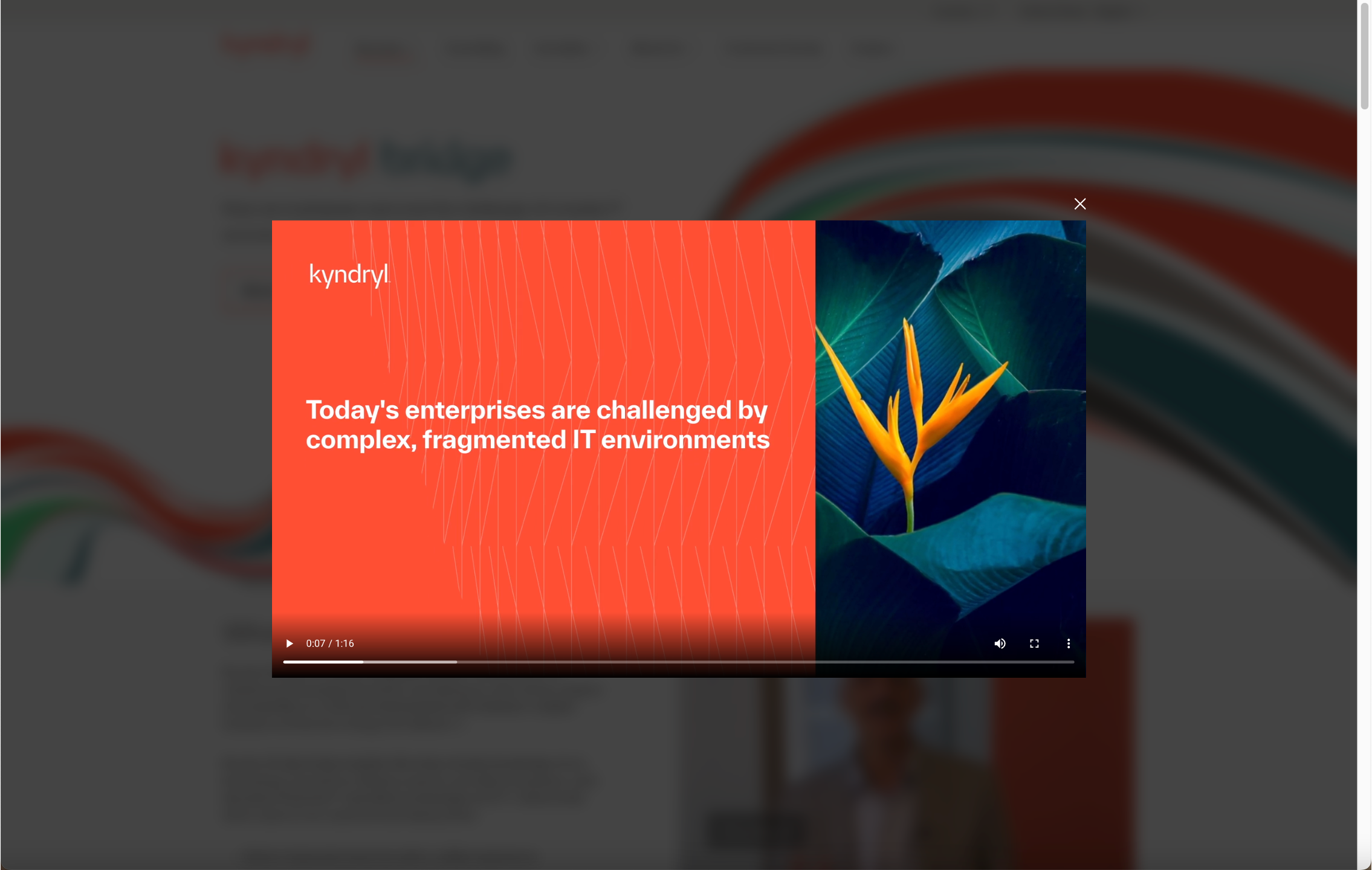
Demo video was great – customer closes it to see what else the “Learn more” page has to offer.
Pain Point:
None
Another slide being tracked
Sub info here
Feeling: Neutral
Observations:
None
Pain Point:
None
New Tracking Slide
You can add subtitle
Feeling: Neutral
Observations:
Here you are
Pain Point:
Your Pain Points
Search Kyndryl.com
Homepage
Feeling: Negative
Observations:
The customer searches for a search box.
Pain Point:
There is no search affordance on the Kyndryl.com website.
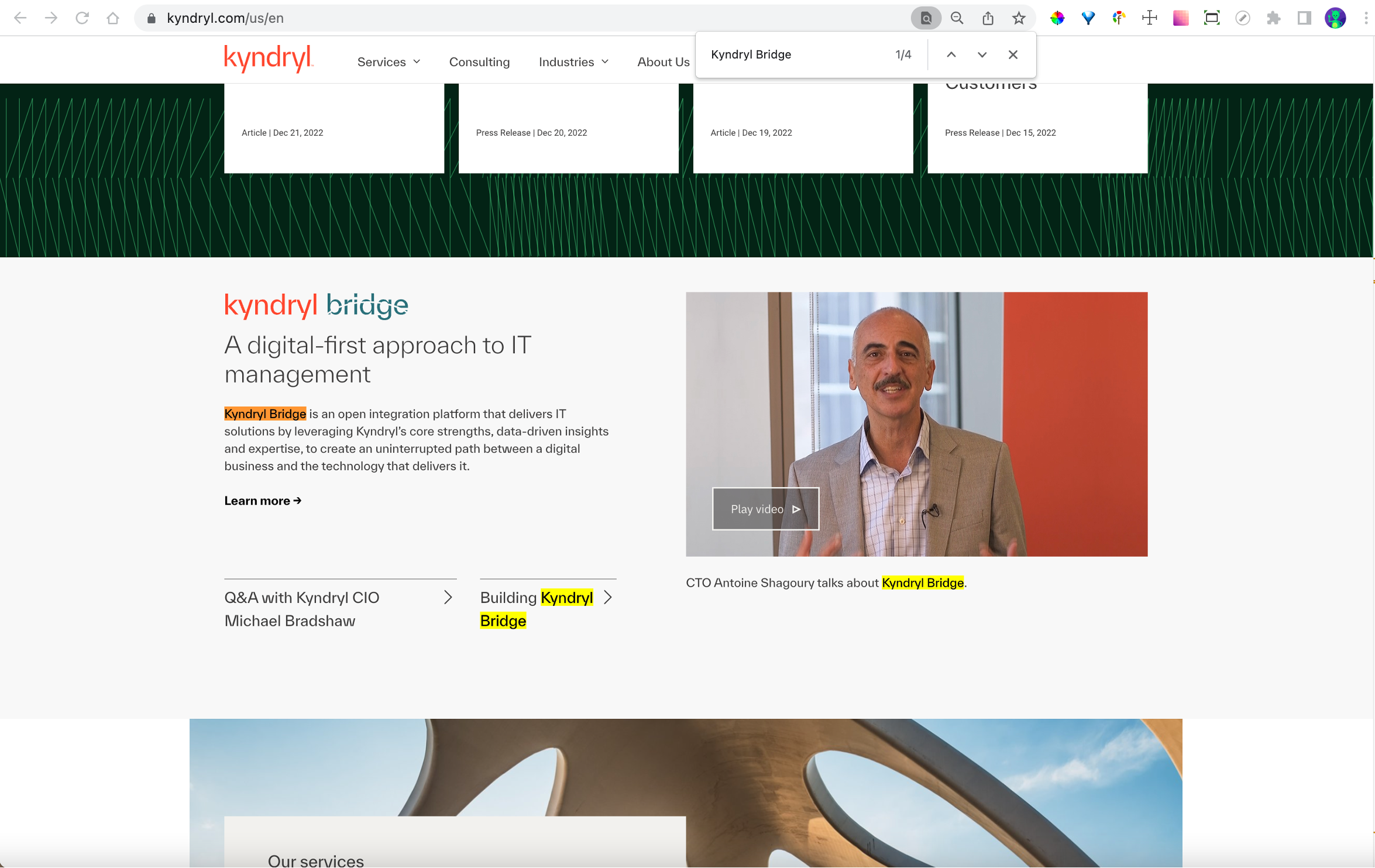
Find KB on Kyndryl.com
Homepage
Feeling: Positive
Observations:
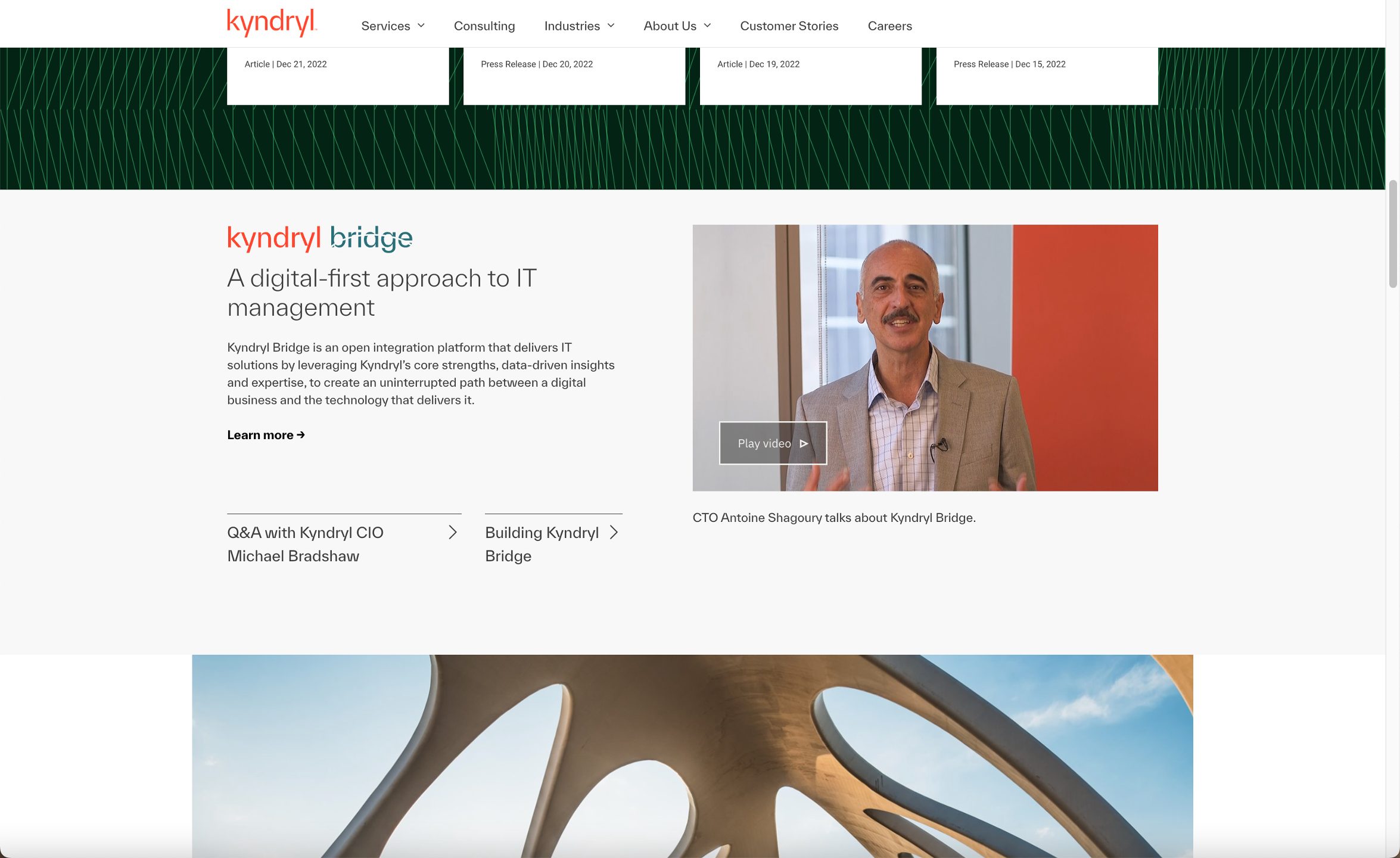
The customer does a text ‘find’ with keywords “Kyndryl Bridge” and locates it some way down the homepage.
Pain Point:
Kyndryl Bridge seems quite far down below fold.
Find Information on Kyndryl Bridge
This is a subtitle
Malcolm Johnson starts his quest for information on Kyndryl Bridge at the Kyndryl.com website
View KB video on Kyndryl.com
Homepage
Feeling: Negative
Observations:
The customer clicks the ‘Play Video’ CTA
Pain Point:
CTA for Play video aside, the link order/precedence seems a little confusing. Customer is uncertain what to click upon next.
Journey Summary
Current Grade
Summary of Pain Points:
- Kyndryl.com has no site Search capability (Slide 9).
- Re-order data hierarchy (Slide 10).
- Precedence of CTA’s; links, carrots Buttons (Slide 12).
- Shrink hero graphic, re-order sections (Slide 14).
- Kyndryl Bridge – more facts further up page on how it might benefit my org.(Slide 17).
- Q&A for KB needs a link back to KB splash page, if/when customer gets a little lost and a contact CTA (Slide 21).
- Kyndryl Bridge ‘Contact’ for more information is too hard to find (Slide 22).
Phase 1
Potential Grade
- As it’s a major initiative, bring KB section above News and insights on homepage (Slide 8).
- Redesign the order of CTA’s within KB section on homepage (Slide 12).
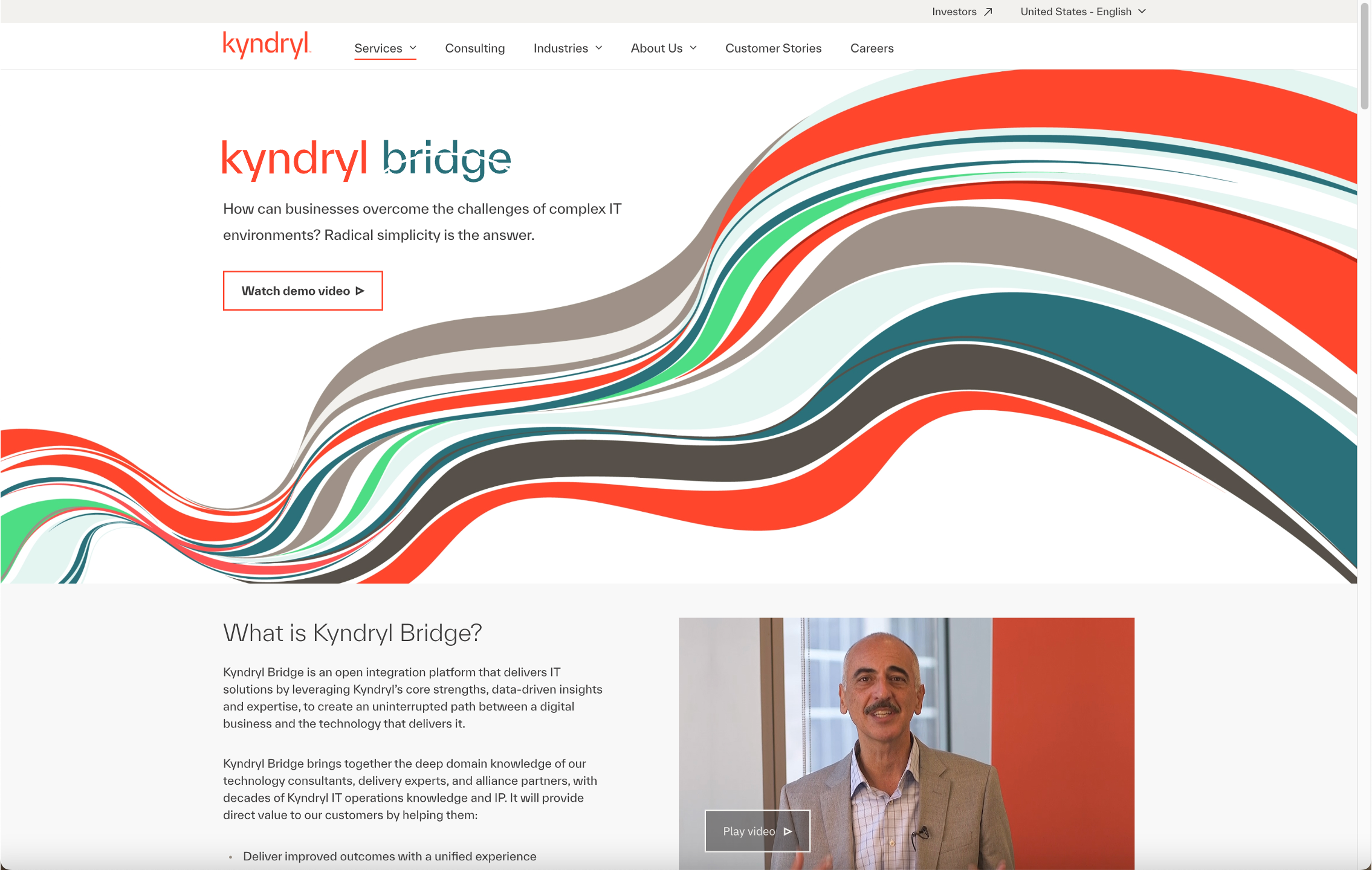
- Reduce size of hero graphic and re-order info. sections on Kyndryl Bridge page (Slide 14).
- Add the benefits of Kyndryl Bridge as small hard facts upfront, they’re a little hidden beneath what seems Marketing boilerplate (Slide 17).
- Add wayfinding back link/CTA from Kyndryl Bridge Q&A on About Us page back to Kyndryl Bridge Splash page (Slide 21).
- Add more prominent CTA for connecting with Kyndryl about Kyndryl Bridge (Slide 21).